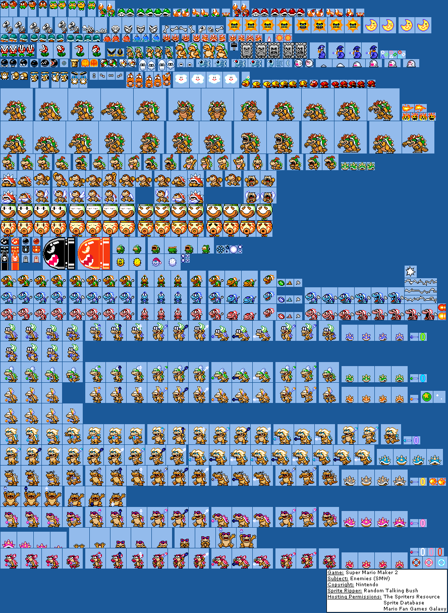
Enemies (SMW)
(Current scale is below 100% - zoom in to view full detail)


| Asset Info favorite | |
|---|---|
| Name | Enemies (SMW) |
| Category | Nintendo Switch |
| Game | Super Mario Maker 2 |
| Section | Super Mario World |
| Submitted | July 6, 2019 |
| Uploaded By | Random Talking Bush |
| Size | 142.50 KB (888x1214) |
| Format | PNG (image/png) |
| Hits | 115,048 |
Animated GIFs (0)
Comments (63)
You must be logged in to post comments.
i just realized, lemmy's ball is a starpoint
my theory is that the artist making the SMW graphics is still the same,he just improved and doesn't have to work with the SNES limitations anymore
Imagine keeping your original palette
-this post was made by the Mario maker smw bowser
-this post was made by the Mario maker smw bowser
i think bowser looking the way he is really works well.
because, he stands out from all of the other really hard-to-take seriously, cartoony characters and makes for a really great (final) boss in that regard.
also i think his new sprite is miles better than his original smw sprite, which was super off model and didn't really look all that great.
because, he stands out from all of the other really hard-to-take seriously, cartoony characters and makes for a really great (final) boss in that regard.
also i think his new sprite is miles better than his original smw sprite, which was super off model and didn't really look all that great.
I honestly think SMW would've looked more dated than SMB in that regard. All the sprites they kept are good enough. The NES styles have a charm to their strange designs. SMW would just look weird. They still aimed to keep what the originals were going for with the new Koopaling sprites. Ludwig is blond, Wendy has huge lips, and Iggy has the diagonal lime eyes.
@Radical Charizard True, but they shoulda made Bowser and Jr more like SMW Bowser in the first place XD
They probably just thought they would look weird next to Bowser, Bowser Jr., and Boom Boom. Plus most would've needed new frames anyway so they just said screw it.
@Globus SMW has a very limited selection of palettes, which all the bosses here break. Furthermore, all the Koopa bosses were drawn in a similar manner, with the Koopalings having a side-view unless turning, 3 fingers (until SMA2), and the same orange on the snout that most of the palettes shared (ie, Troopa skin). If this breaks what can be done in SMW itself without modifying SMW's limited selection of palettes, it's not in SMW style, and if it looks absolutely different from the exact same entity's appearance in SMW, it is by default inaccurate to SMW. The Koopa bosses here are absolutely not "SMW style" Koopa bosses, but a custom style mixing attributes, nostalgia filter, and actual skill independent of SMW's designs. They're not bad sprites, but they're bad at their job, basically.
Now, had they done this in SMA2 (which they absolutely should have), this wouldn't be an issue. But if they're going to say this is how it appeared in SMW when it absolutely isn't, then that's a problem.
Now, had they done this in SMA2 (which they absolutely should have), this wouldn't be an issue. But if they're going to say this is how it appeared in SMW when it absolutely isn't, then that's a problem.
I'm still not quite understanding the argument that the sprites "aren't in SMW style", considering that SMW doesn't even have a style to begin with, and also that multiple sprites from the original are shaded in a similar way
Imagine if they kept all the old designs
@Gamey While that would be cool, these break the palette limitations so much that serious editing would need to be done beforehand, and then they'd look like crap regardless.
i'd love it of someone made a smw rom hack that replaces the koopalings and bowser's sprites with these! It'd be pretty cool.
And see, that's the problem. The SMW sprites sucked, so by making these good, they are by default not SMW style.
@hansgunkee definitely. they look more smoother and better than the snes ones.
new Koopaling sprites was Better Than SNES.
These new Koopaling sprites are absolutely gorgeous. In my opinion, pretty much all of the boss sprites in SMW (besides the Reznors) looked abysmal, and these sprites here are way better. I really like what Nintendo did with them. One extremely minor nitpick I have with them though is that their wands are the wrong colors. I'm probably the only one who cares, tbh.
That's the point. SMW's enemy and boss sprites tended to look mediocre or rough at best and terrible at worst, so by having what amounts to pastel-tinted SMW2 sprites, they are not capturing how the actual SMW looks.
@Doc von Schmeltwick I know right? They look even better than Mario. But I really like how they look because I don't like how SMW looks originally.
I personally always thought the original SMW sprites for the Koopalings looked really bad, so I’m alright with the change. I do like that Iggy’s eyes look the same as on his original sprite though
(look at Ludwig's hair, and watch this episode if you don't know what I mean)