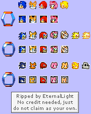
Life Icons
(Current scale is below 100% - zoom in to view full detail)
| Asset Info favorite | |
|---|---|
| Name | Life Icons |
| Category | Game Boy Advance |
| Game | Sonic Advance 2 |
| Section | Miscellaneous |
| Submitted | A long, long time ago |
| Credits | EternalLight |
| Size | 4.44 KB (180x226) |
| Format | PNG (image/png) |
| Hits | 19,296 |
Animated GIFs (0)
Comments (7)
You must be logged in to post comments.

Out of all of them, the third row is the best one. The first row is just the characters' heads from their regular sprites, and the second row just looks hideous. The third row, however, is a good case of minimalism, what with their heads being silhouetted but their eyes are left as they are so you're still given a clue as to who the character is.
It looks like the artists decided to get more minimalistic with them with every entry.
It's funny to me how ironically the icons were minimalized in later games. Although at least Super Sonic's icon in Advance 3 isn't just a recolor of the regular Sonic.
for some reason the same sheet is uploaded to here and advance 1

Damn, what were they DOING with the second row of icons?
@MarioMadness734 your right!

I assume the one at the top is Sonic Advance, in the middle is Sonic Advance 2, and the one at the bottom is Sonic Advance 3?