Title Cards
(Current scale is below 100% - zoom in to view full detail)
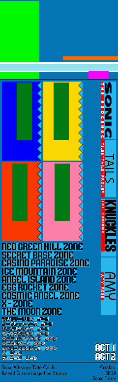
| Asset Info favorite | |
|---|---|
| Name | Title Cards |
| Category | Game Boy Advance |
| Game | Sonic Advance |
| Section | Miscellaneous |
| Submitted | November 27, 2018 |
| Uploaded By | Storice |
| Size | 18.38 KB (240x773) |
| Format | PNG (image/png) |
| Hits | 14,012 |
Animated GIFs (0)
Comments (8)
You must be logged in to post comments.

(Just like @TheGoku7729 said) It's actually a reference to this Sonic Adventure promotional artwork:


amy's text is bauhaus
@JoshTheHedgehog33 i think Amy's text could be a reference to CD, as it kind of looks like it. I could be wrong though.
These fonts are all based off of promo art from Adventure 1

My guesses as to why each character got each font.
Sonic - Main series font, main character - you get the picture.
Knuckles - Bold and tall, much like the character.
Tails - It resembles the title card font from Sonic 3, perhaps a nod to when the fox got his abilities in a playable form?
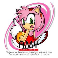
Amy - Generally, I got nothing.
Sonic - Main series font, main character - you get the picture.
Knuckles - Bold and tall, much like the character.
Tails - It resembles the title card font from Sonic 3, perhaps a nod to when the fox got his abilities in a playable form?
Amy - Generally, I got nothing.

All four of them get a different font but Tails and Amy's stick out more for not being as bold as Sonic's or Knuckles's. It's weird but definitely intentional.

they didn't get generic fonts
I don't like how Sega decided that sonic and knuckles get detailed fonts while Amy and Tails just get generic fonts. why?