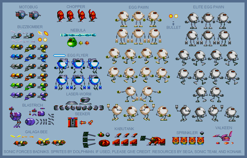
Badniks (Sonic Forces)
(Current scale is below 100% - zoom in to view full detail)
| Asset Info favorite | |
|---|---|
| Name | Badniks (Sonic Forces) |
| Category | Custom / Edited |
| Game | Sonic the Hedgehog Customs |
| Section | Badniks & Enemies |
| Submitted | November 12, 2017 |
| Uploaded By | Dolphman |
| Size | 62.29 KB (798x510) |
| Format | PNG (image/png) |
| Hits | 35,813 |
Animated GIFs (0)
Comments (16)
You must be logged in to post comments.
@RealMargaretThatcher, I'd say that it's because Metal Sonic's design is just too iconic (mainly why it's design stayed the same in Boom). As for Orbot & Cubot, like you said they're comic relief characters, so keeping the silly, cartoon-y designs just work for them.

Why were these designs changed, but Metal Sonic and the 2 comic relief henchmen stayed the same?
These Forces designs of Eggman's Badniks actually grew on me. Even though, you could easily smash them like bowling pins in the game, I still like the militaristic and modernized feel of these enemies.
The Egg Pawns, especially, had the redesign I liked the most. Their color and simplistic design makes me think they're eggs—hence their name and creator—and just felt natural.
The Egg Pawns, especially, had the redesign I liked the most. Their color and simplistic design makes me think they're eggs—hence their name and creator—and just felt natural.
So apparently Blastrich's official name is.....wait for it.....
....Egg Walker. Despite that already being used for at least two other things.
....Egg Walker. Despite that already being used for at least two other things.
These are cool sprites. I love cool sprites. Please do more cool sprites in the future.

This is an example of how bad a game can be, but how good an artist can be. I like it, sorry if this sounds mean but I hate Sonic forces. Sonic forces you to keep making art.
@//X-Gluon// I think most were made by Infinite in-game, so that may explain it...
I don't think I'll understand Eggman's sudden change of design taste in Sonic Forces.

The designs of the badniks in Forces just shows how bland and uninteresting the game is overall.

The EggPawns are slightly too round, in game they had rectangle hips
And the rest are not quite round enough. Nebula and chopper especially.
And the rest are not quite round enough. Nebula and chopper especially.
I like that the Egg Pawns actually look like eggs, the other designs could have used more personality. I guess they were going for mass-produced, everything about Eggman's mechs and first boss fight Screamed the "Taking over the worlds on a budget" plot from Sonic 4.
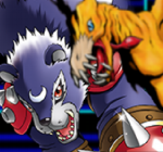
RoboMotobug heh heh (despite its already a robot)

@Doc Von Schmeltwick
Blame it on Egghead.
Blame it on Egghead.
@Doc Von Schmeltwick
If Lockjaw was metalic
If Lockjaw was metalic
Does that "Blastrich" have a ROB head?
Also why, oh WHY did they make these even more technologically unrecognizeable than Colors did? I mean, the designs are so simplistic, there isn't any SOUL to them, you know? I guess that's probably the point, but still, if you want people to be able to so much as tell your enemies apart.....for shame, SEGA. For shame.
Also in no way does that Chopper look like Lockjaw from DKC2, amiright?
nice! i'm going to add these to a fangame im working on.