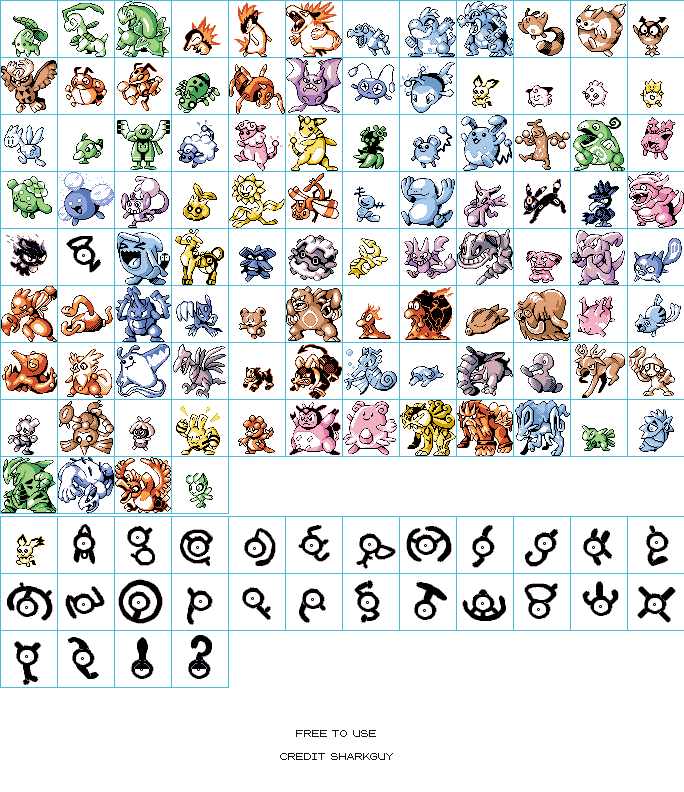
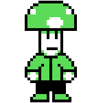
Johto Pokémon (R/G/B-Style)
(Current scale is below 100% - zoom in to view full detail)
| Asset Info favorite | |
|---|---|
| Name | Johto Pokémon (R/G/B-Style) |
| Category | Custom / Edited |
| Game | Pokémon Generation 2 Customs |
| Section | Other Pokémon |
| Submitted | April 22, 2020 |
| Uploaded By | SharkGuy |
| Size | 135.90 KB (684x792) |
| Format | PNG (image/png) |
| Hits | 19,023 |
Animated GIFs (0)
Comments (13)
You must be logged in to post comments.

These comments I made have aged so poorly oh god
@eeveevee: It's between Misdreavus and Wobbuffet, since it was considered the "default" for this sheet (normally "A" is).

Hey where's the unown "G" variant?
LOL THEY DONE NOTHED EAR PICHU, (gen 2 is my fav gen) ty for making this btw!
I feel if there's any sprite you should maybe rework a little its that chinchou, the body should be more well rounded by getting rid of that upper left edge
@Neslug Same to you

That is fine. Hope you have a good day, and stay safe.
I am personally content with how I'm currently doing the sprites and have no intentions on redoing everything from square one, but I understand the issue.
@MishuK9 Yes, definitely. I'm quite familiar with Pat Ackerman's spritework but I think his sprites, certainly excellent, have a different problem: the linework and highly consistent designs more resemble GSC but they use shades of one color like RGB, not to mention they're fairly large. But people are making these for fun so it really isn't a huge deal and I didn't want my initial post to come across like that.
Imitating certain styles can be difficult, especially if the style isn't really consistent because it was actually multiple people with differing approaches to spriting. The stereotype of RGB being funny or weird-looking probably started with the popular ones people like to post, like Golbat or Venusaur. Maybe the secret of capturing the style lies in not focusing on the poses, but in trying to slightly "reinvent" the designs while keeping most of the core details?
Imitating certain styles can be difficult, especially if the style isn't really consistent because it was actually multiple people with differing approaches to spriting. The stereotype of RGB being funny or weird-looking probably started with the popular ones people like to post, like Golbat or Venusaur. Maybe the secret of capturing the style lies in not focusing on the poses, but in trying to slightly "reinvent" the designs while keeping most of the core details?
@Neslug I honestly really agree with you, and I've thought that about other peoples' fanmade gen 1 sprites I've seen over the years. A bunch of Red/Blue/Green sprites do look good. And I've definitely seen other fanmade sprites that capture that. Sharkguy still did good as a whole though, and clearly put tons of effort into all their custom sheets.
@Neslug While I see exactly what you're talking about, I still think I did a good job and feel like I acomplished what I wanted, that being a blend of off-model and on-model.
I'll also agree with Skarmory too.
I'll also agree with Skarmory too.
Whenever I see people attempting the RGB style, I honestly think they really overplay the incorrect proportions and weird poses. Looking at a complete sheet of all the official RGB sprites, I see more than a dozen Pokémon that are almost completely on-model and accurate to current designs (for example, Clefable, Electabuzz and Gyarados).
In terms of the shading and broken outlines, these are really good. But overall, I think you tried too hard to make them look bad or weird; which in turn makes some of them, such as Furret and Wobbuffet, look way too big. The actual RGB Pokémon are surprisingly consistent with their sizes.
While a lot of the official sprites aren't so good, it honestly looks like the artists tried their best to make good artwork. The quality varied because not all of the artists were equally skilled, which makes the style extremely difficult to imitate on a large scale like this. Don't want to put you down, because you clearly have the skill. I think Skarmory turned out the best and could really pass as real.
NOTE: While these may be free to use, that still means you must credit me