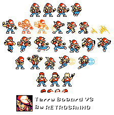
Terry Bogard (Mega Man NES style)
(Current scale is below 100% - zoom in to view full detail)
| Asset Info favorite | |
|---|---|
| Name | Terry Bogard (Mega Man NES style) |
| Category | Custom / Edited |
| Game | SNK Customs |
| Section | Characters |
| Submitted | May 4, 2026 |
| Uploaded By | RETROSANHO |
| Size | 9.30 KB (224x226) |
| Format | PNG (image/png) |
| Hits | 2,493 |
| Tags (4): | |
Animations (0)
Comments (11)
You must be logged in to post comments.
Today, I made one last update of Terry Boguard in the Megaman style, the V3!
Thank you very much, making this sprite sheet was quite laborious because there wasn't a single Terry sprite online, or even on the website itself, that wasn't a "Megaman cosplaying as such and such character"So I had to make do with the Terry sprite from the Mega Drive as a base to create the 8-bit version

These are really cool! It kind of reminds me a bit of the Chibi Neo Geo Pocket style fighters, and I appreciate that it fits in the Mega Man style but isn't like trying too hard to be exactly like Mega Man's player sprites.
YOU GOT NEW WEAPON: BUSTER WAVE
YOU GOT NEW WEAPON: BUSTER WAVE
Thank you so much! I'm glad you liked it. I revised Terry's sprite sheet to correct a few things, but it's been pending for months...

As the worlds #8 biggest Terry fan and overall Megaman enjoyer, I gotta say these are Nifty AF. great job!
Thank you very much :)
I greatly appreciate your feedback and criticism, I am working on a version 2.0 correcting some of the issues mentioned. And I accidentally replied to your comment in the report section because I'm new to the site 😅

I don't think this is entirely NES compatible. The sprites use more colors than each 8x8 sprite should be capable of using without overlapping, and I struggle to see how said overlapping would work, especially with regards to the projectiles which use very different palettes from Terry himself. If anything, it'd fit more in with how Mega Man 9 and 10 does their sprites.
The bounding boxes for the sprites are also very messy. Some appear to be the wrong size and the hat for the "Junp" sprite is outside the bounding box entirely. I'd assume most of this would be accounted for by sprite overlapping, however not only is that not very clear, it's also not something NES games would do to this extent. Most NES games would avoid sprite overlapping so as to avoid sprite flickering.
All that said, these are still very good sprites, especially for a first submission. They're very vibrant and fit the Mega Man style well, even if they don't fit the NES limitations well at all. I can only see you getting better.
The bounding boxes for the sprites are also very messy. Some appear to be the wrong size and the hat for the "Junp" sprite is outside the bounding box entirely. I'd assume most of this would be accounted for by sprite overlapping, however not only is that not very clear, it's also not something NES games would do to this extent. Most NES games would avoid sprite overlapping so as to avoid sprite flickering.
All that said, these are still very good sprites, especially for a first submission. They're very vibrant and fit the Mega Man style well, even if they don't fit the NES limitations well at all. I can only see you getting better.

Oooh, this is like. Really good!
Oh yes, if you noticed the mistakes with the poorly fitted frames behind Terry I'm sorry, because it was the first time I did that.
My biggest inspiration for creating this Terry sprite was the fan game Megaman X Street Fighters, the concept of fighting characters in a platform game has never been so brilliant