Sonic
(Current scale is below 100% - zoom in to view full detail)
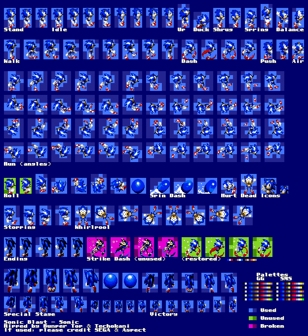
| Asset Info favorite | |
|---|---|
| Name | Sonic |
| Category | Game Gear |
| Game | Sonic Blast |
| Section | Playable Characters |
| Submitted | A long, long time ago |
| Uploaded By | Techokami |
| Contributors | Bumper Top |
| Size | 84.80 KB (624x680) |
| Format | PNG (image/png) |
| Hits | 48,183 |
| Tags (3): | |
Animations (1)
Roll

Comments (25)
You must be logged in to post comments.

Reply to comment by Techokami posted Jul 13, 2026 6:19 PM
Thank you! I’ll make sure not to repeat the same process I had done before with this rip for any future rip.

kind of a weird thing seeing the unused sprites here

THERE. This sheet should NOT need any more revisions, unless we get some weird new prototype with different sprites.
With some of the games, yes it would make sense to stick to the internal order, because those actually have a logical order to them. But with this game in particular, the internal order is very disorganized and will likely confuse people who want to use the sheet. Especially with how part of the roll/jumping animation is separated from the rest of the frames, the angled run doesn't have its angles in a consistent order, and the pushing animation is scattered throughout the sheet.
I really didn’t want to make the sheet too big so I tried to keep everything a tad organised even if it looks cluttered. Also about the animations, I just felt it would’ve been more logical to keep the internal order. These don’t excuse at all the poorly way the sheet is, and I just want to make everything organised better with some future sheets I’m working on. If anything, it’s been more so laziness on my side while I made this sheet.
So I see Bumper Top submitted a revision which adds palettes, highlights dead space, and presents the unused strike dash animation with its broken palette... but, why did you break the 8x8 grid alignment? And why are the frames in a disorganized mess? Internally they were stored in this order, but to make things more usable for people I try to group animations together logically and also adhere to a fixed grid size that also plays nicely with the tile size used.

Imma try to make these sprites better hold up

From farther away, the sprites don’t look that bad, but instead of this style i would prefer a more mainline style

Sonic ANTONBlast

Or Sonic Kong Barrel Blast

Victory pose ✘
Sonic flipping you off ✔
Sonic flipping you off ✔
Or Sonic BlASSt

S O N I C A S S B L A S T
@Technokami I was referring to the icons of Ton, Dazz, Jetters, etc (a relic of which is the similar, but certainly not identical .gif of Dazz that still exists on the "select a letter" part of the site.).
The poses for said icons were far less dynamic, but Ton's was animated via lantern glow, I think?
The poses for said icons were far less dynamic, but Ton's was animated via lantern glow, I think?
When i was little, when sonic would waggle his finger when choosing your character i thought he was flipping me off so i'd never let my parents see the game. :P
Yeah I remember when icons had to be made manually. A program was made with Java that facilitated the creation of icons. Now it's done "automagically" with CSS and a preview image.
Wow, I found this site in what, 2008? The updates were done as they are now, but the icons for them were pixel artwork, and the theme was greyish green instead of this salmon pink color.

@Techokami Ah, those days were so simple.

The original sheet I ripped back in like, 2004 or 2005. Back then, tSR was updated manually in raw HTML and sheets were organized by franchise -> game rather than console -> game like it is now.

Oh man, look at that death sprite.
| keyboard_double_arrow_left keyboard_arrow_left | Page 1 of 2 | keyboard_arrow_right keyboard_double_arrow_right |