Psycho Sigma
(Current scale is below 100% - zoom in to view full detail)
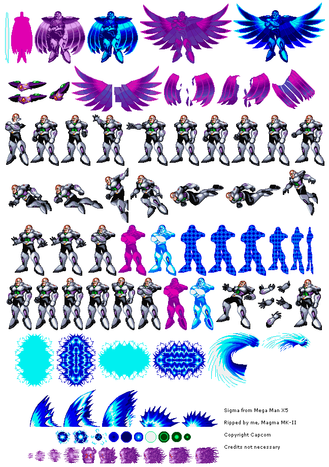
| Asset Info favorite | |
|---|---|
| Name | Psycho Sigma |
| Category | PlayStation |
| Game | Mega Man X5 |
| Section | Other Bosses |
| Submitted | January 11, 2017 |
| Uploaded By | Magma MK-II |
| Size | 108.22 KB (648x918) |
| Format | PNG (image/png) |
| Hits | 15,586 |
| Tags (2): | |
Animations (0)
Comments (5)
You must be logged in to post comments.

Being "artwork accurate" matters very little when the internal resolution of the game is 240p (that's the same as the NES)
That still doesn't takes away from the key issue that there has been a downgrade in animation quality when one of the main moves the character does is bounce across the screen from side-to-side with no in-betweens frames or basic easing (you can't actually call it "smooth" when motion is done in a single frame). It contrasts very badly against the playable character (which tbf it's largely recycled from the previous game) having many frames of animation and this one having less animation than the SNES sprites. None of his poses are actually dynamic at all, it's just a bald man standing still
That still doesn't takes away from the key issue that there has been a downgrade in animation quality when one of the main moves the character does is bounce across the screen from side-to-side with no in-betweens frames or basic easing (you can't actually call it "smooth" when motion is done in a single frame). It contrasts very badly against the playable character (which tbf it's largely recycled from the previous game) having many frames of animation and this one having less animation than the SNES sprites. None of his poses are actually dynamic at all, it's just a bald man standing still

X5 Sigma: Clear visual direction and colors complement, detailed effects with body parts that shift in a smooth manner, complete sprite adaptation of the artwork that has every detail intact.
X4 Sigma: Messy visual direction with incompatible colors, basic effects and choppy animation with parts reused from other frames, sprite adaptation was not possible (details were improvised or outright removed from artwork)
X4 Sigma: Messy visual direction with incompatible colors, basic effects and choppy animation with parts reused from other frames, sprite adaptation was not possible (details were improvised or outright removed from artwork)

"Look! Every time I move my arm, it costs Capcom 42 bucks!"

X4 Sigma: Highly detailed sprite with many frames of animation
X5 Sigma: Very basic design with a distinct lack of in-between frames for his attacks, looking pretty stiff and weightless
X5 Sigma: Very basic design with a distinct lack of in-between frames for his attacks, looking pretty stiff and weightless
Like X4 Sigma, who glides across the air and suddenly stops in the same frame to throw his scythe, which looks bad in spite of him having frames for a landing animation after, or how his boomerang attack reuses frames from his intro animation and just has them pop up again with a flash. How Psycho Sigma moves resembles X1 Sigma, and both have frames before they begin dashing. Both only have one frame for moving across the screen - the reason why it looks weirder in X5 is because he moves slower, which was done for balancing reasons. Moreover, subdued animations have the benefit of implying weight between different actions.
And as such, X5 Sigma's attacks are smoothly animated for what they are. The shockwave attack feels heavy due to quickly going through a decent amount of frames, contrasting with the weaker-feeling sparks. Even during said spark attack, there are details like him clutching his other fist as he releases them. He also has the best cape toss animation, which manages to feel appropriately floaty. If we're going to call any Sigma "just a bald man standing", what does X4 have when the laser attack has his arms just rapidly shift positions as vector beams fire out of his eyes? I guess it looks more dynamic, but the sprite in isolation is just bald man standing with arms spread.